
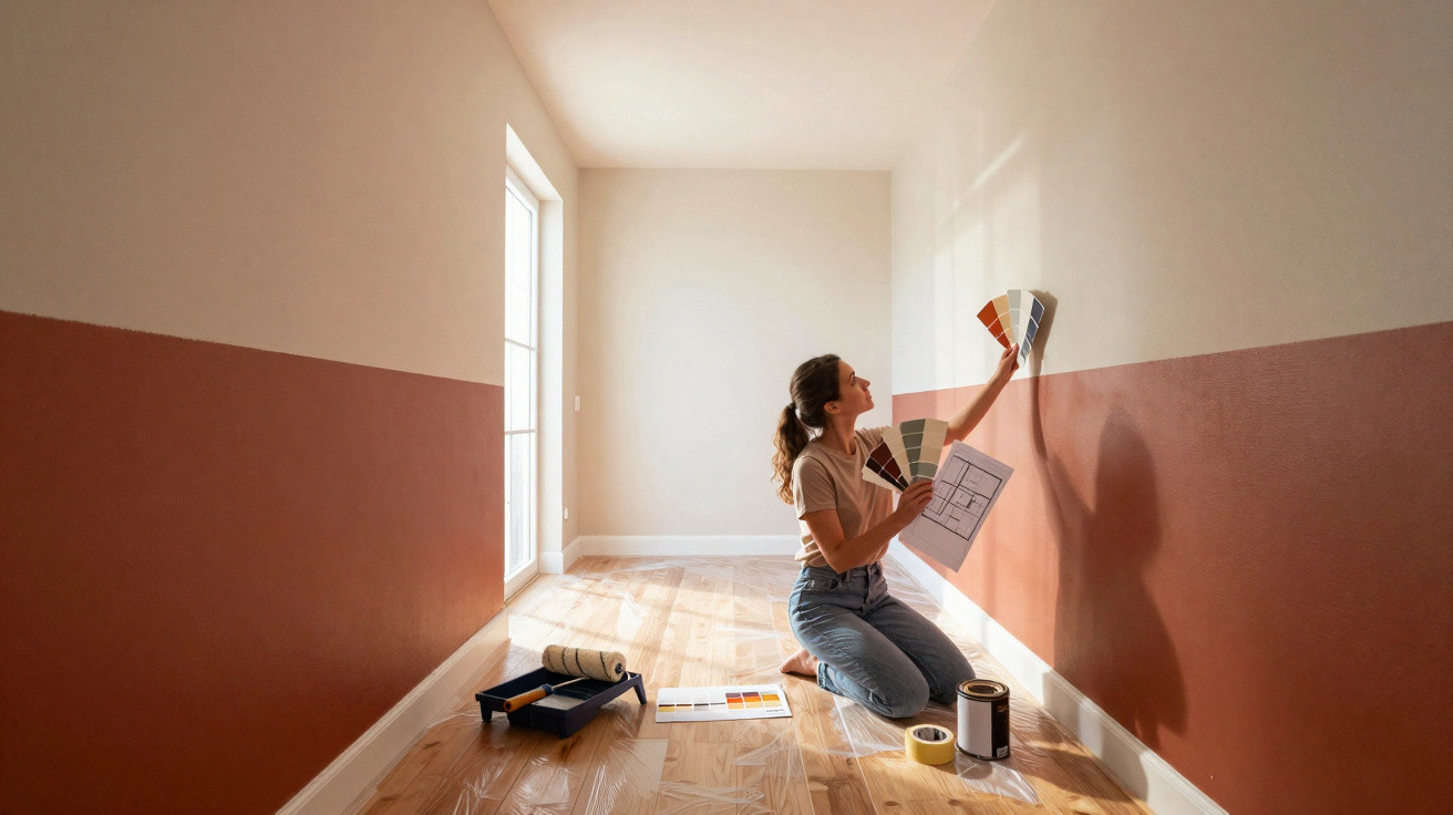
Rather than repainting everything from scratch or even moving walls, many interior professionals are now borrowing a trick from the beauty world: with carefully placed colour, a room can be made to look slimmer, longer, more balanced - much like facial contouring.
What’s behind room contouring
The principle is straightforward: you don’t paint for “prettiness”, you paint with intent. Colour becomes a tool for adjusting proportions and directing the eye, with light and dark tones playing clearly defined roles.
"Room contouring uses the same effect as make-up: dark shades visually recede, light shades come forward - creating new proportions without moving a single stone."
Paint expert Helen Shaw from the brand Benjamin Moore explains it this way: by using graduated tones on walls, ceilings, alcoves, mouldings and other details, you can bring certain surfaces forward while pushing others back. The result is a space that feels deeper, calmer or more organised, even when the architecture is awkward.
At its core, the technique works with perception:
- darker shades appear to fall away
- lighter shades seem to move towards you
- soft transitions can “soften” harsh edges
- purposeful contrast guides attention to highlights
You don’t gain a single square metre in reality, but the sense of space can change dramatically. A cleverly planned paint scheme can make an endless corridor feel shorter, or turn a vast, cool living room into something far cosier.
When the layout feels wrong: typical problem rooms
A long, narrow-looking living room
It’s a familiar scenario: a living room shaped like a tunnel. You arrange the furniture and quickly notice how restless and unbalanced everything feels. A standard all-over white paint job often makes that effect even stronger.
With room contouring, you can visually break up the length. One real-world example: designer Melissa Oholendt transformed a very large, elongated living space without any building work - using colour alone.
- the main walls were painted in a deeper shade
- the ceiling area in the living room was picked out in a warm taupe-grey
- neighbouring zones such as the hallway and dining area were given lighter, closely related tones
This created subtle zoning. The room now reads as shorter, more sheltered, and far less like a sports hall. The darker walls visually pull the planes closer, while the slightly differentiated ceiling still ties the living room and adjoining areas together in a cohesive way.
A big room with a cold atmosphere
Bigger doesn’t automatically mean more comfortable. High ceilings and lots of open area can feel chilly and empty - especially when everything is painted white. This is exactly where deeper colour shows its strengths.
"Dark tones on individual walls or in niches 'pull' the room together and create a feeling of closeness - perfect for generous but sterile living areas."
A rear wall in deep petrol, a fireplace painted in warm dark grey, or a corner in a rich green: these kinds of surfaces gather the eye and take the edge off a space that feels too expansive. Pair them with warm materials such as wood and textiles, and the atmosphere becomes inviting - almost like the room is wrapping around you.
A cramped loft room or attic conversion
Sloping ceilings make many people uneasy: head height drops, you can easily bump your head, and the room can feel compressed. The classic reaction is to paint everything white to make it look “bigger”. That can work, but sometimes it amplifies the sense that the slope is pressing down.
With contouring, a braver plan can pay off:
- paint the vertical walls in a medium, warm shade
- choose the sloping section one to two shades darker
- if needed, make one gable wall noticeably darker to add depth
Because the darker slope visually recedes, the room feels less like a low box. The lighter upright surfaces provide orientation and make the space appear more clearly structured.
An endless, narrow hallway
Hallways are made for room contouring. They’re often too long, too tight, and short on daylight. Here, colour can be used very precisely to reduce the “tube” effect.
Typical approaches:
- paint the end wall in a warmer, darker tone - this visually “brings” the end closer
- keep the side walls lighter and more understated so they don’t feel closing-in
- make the ceiling a touch darker than the walls so the corridor feels less tall and hollow
Combined with targeted lighting, the hallway suddenly feels like a deliberately designed space rather than a purely functional passage.
Using colour to highlight architecture on purpose
Room contouring doesn’t only adjust proportions; it can also spotlight architectural features rather than trying to disguise them.
Interior designer Jennifer Hunter illustrates this with an example featuring a large bank of windows. Instead of downplaying the dominant shape, she chose to emphasise it:
- the other walls were kept calmer and more restrained
- the window reveal was painted in a warm, cheerful yellow
- textiles and patterns in the room subtly echoed the same colour note
"Light, friendly tones on protruding elements such as bay windows or large window frames guide the eye exactly there and enhance the sense of depth."
Because the window wall already projects into the room, the lighter shade strengthens that effect and creates a clear focal point. The eye “anchors” on the window zone, making the room feel deeper and more alive. Paired with floral wallpaper, it almost gives the impression of standing right at the edge of a meadow.
Matt, silk, or gloss: choosing the right finish
The impact isn’t just about the colour itself - the finish matters too. Different sheen levels reflect light in different ways, which changes how the room reads.
| Finish | Light effect | Ideal for |
|---|---|---|
| matt | reflects very little light; looks calm and deep | large areas, feature walls, niches |
| velour / silk | slight sheen; hard-wearing; subtly lively | living rooms, hallways, children’s rooms |
| gloss | highly reflective; highlights every edge | doors, mouldings, individual accents |
Helen Shaw clearly recommends matt or velvety finishes for any surfaces you want to “sculpt”. They absorb part of the light, which strengthens the impression of depth. Gloss paints, by contrast, reflect strongly and can undo that effect by making every edge and imperfection stand out.
In practical terms: use matt or velour finishes for broad walls and ceilings, and pick out details such as doors, built-ins or window frames in a slightly shinier option.
How to tackle room contouring at home
If you want to apply the technique yourself, you don’t need to overhaul the whole house. A planned, step-by-step approach helps avoid expensive missteps.
- Name the problem clearly: does the room feel too long, too low, too tall, too large, too busy?
- Decide the sightline: where should the eye land first - the window, the sofa, the dining table, the fireplace?
- Plan the contrasts: which areas should recede (darker), and which should come forward (lighter)?
- Choose the finish: matt for spatial effect; gloss only in very selective accents.
- Test first: check sample cards at different times of day before opening the big tin.
Especially in small flats, a single well-placed colour move can be surprisingly powerful: a dark wall behind the bed, a framed ceiling detail in the living room, or a gentle colour transition from the hallway into the living area.
Risks, limits, and helpful combinations
Naturally, it’s possible to overdo the technique. Too many hard contrasts can make an already fussy layout feel even more hectic. If every projection, niche and corner is painted a different colour, the result tends towards chaos rather than clarity.
A simple guideline helps: stick to no more than two to three main tones per room, plus one to two accent colours that repeat. That keeps the overall look calm, even while the proportions are being intentionally shaped.
Lighting and textiles are strong partners for room contouring. A focused light on a dark wall creates depth, and a rug that ends exactly where a colour-blocked wall section stops reinforces the zoning you’re aiming for. Curtains can visually lengthen or shorten tall windows too - depending on how high you mount them.
Once you understand the basic idea, it’s easy to adapt: in a home office that shouldn’t feel like a workplace, in children’s rooms that evolve as they grow, or in a rental where you’re not allowed to move walls. Room contouring usually costs only a few tins of paint and some time - yet day-to-day it can feel as transformative as a mini renovation.






Comments
No comments yet. Be the first to comment!
Leave a Comment